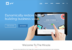
Welcome Everyone!
Thank you for taking a time for visiting this page either you've purchased or interesting it. We are introducing you the Grid X template that is the best theme we've ever built. Very first you should be familiar with this document and read carefully details because the purpose of this file is to cover & explain you all possible variations and usages and save your time.
VIDEO TUTORIALS SUPPORT FORUMGeneral
Installation
Follow the steps below before you to get started:
- Open the
GridXdirectory from all the template downloads. - Upload template files to your Web Server using FTP client software
- Your site will work at least with following required files/folders:
css/Stylesheets Folderimages/Images Folderjs/Javacripts Folderplugins/Plugins Folderstyle.cssMain Stylesheetindex.htmlIndex File
- Add your content and customize the template for your need.
Folder Structure
The template has followed next folder structure and each folder has multiple files and I didn't print all the single file names here to prevent very high tree. You can find the files quickly by folder names that needs to edit and use.
Main folder has 50+ html files named their relevant content. Read names and find your proper file to get the html content.
gridx/
├── css/
├── images/
├── js/
├── plugins/
│   ├── bootstrap/
│   ├── elegant-font/
│   ├── magnific/
│   ├── masterslider/
│   ├── mediaelement/
│   └── owl-carousel/
├── index.html
├── style.css
└── *.*
GRID X
Proudly introducing this section. This feature is a biggest feature of our template and makes huge difference between this template and competitors. You can build more than 21 completely unique grid layouts with a different gap spaces and opening types. See the possibilities table.
Grid Options
| Options | Layout | |||
|---|---|---|---|---|
| Grid X | Even Grid | Masonry | ||
| Post Style | 1. Title, Category & Format | 1. Title bottom | ||
| 2. Image + Hover Image | ||||
| 3. Scaled border hoverlay | ||||
| 4. Buttons + Title | 2. Excerpt & Format | |||
| 5. Title + Category | ||||
| 6. Animated title hoverlay | ||||
| 7. Logo hoverlay | 3. Title bottom & Hoverlay | |||
| 8. Title raise up | ||||
| 9. Flip | ||||
| Size | Width & Height / In pixels | Ratio | 1x1 | By Columns (1-6) |
| 4x3 | ||||
| 3x4 | ||||
| 16x9 | ||||
| By Columns | (1-6) | |||
| Open type | Push state | Inline | ||
| Modal | ||||
| Permalink | ||||
| Gutter | In pixels | |||
Play with following LIVE BUILDER and generate your desired layout. Get the HTML or JSON format and place it in your html files.
Grid Builder
Markup Structure
General Structure
This is main html structure and most of pages followed this structure.
<!DOCTYPE html>
<html lang="en">
    <head>
        <title>Grid X</title>

        ... <!-- Stylesheet & Header includes -->

    </head>

    <body>
        <div class="wrapper">

            <header id="header" class="navbar navbar-default">
                ...
            </header>

            <section class="page-title">
                ...
            </section>

            <section class="content">
                ...
            </section>

            <footer id="footer">
                ...
            </footer>

        </div> <!-- .wrapper -->

        ... <!-- Scripts includes -->

    </body>
</html>
Containers & Layouts
Bootstrap requires a containing element to wrap site contents and house the grid system. You may choose one of two containers to use in your site. Note that, due to padding and more, neither container is nestable.
Use .container for a responsive fixed width container.
<div class="container">
  ...
</div>
Use .container-fluid for a full width container, spanning the entire width of your viewport.
<div class="container-fluid">
  ...
</div>
Boxed
Use the .boxed class on the body for making boxed feel on an entire content section.
You can use this class on #header, .content, #footer, .sub-footer sections separatedly if you wish to box them individually.
<body class="boxed">
    ...
Fullwidth & Fullscreen sections
These layouts are popular nowadays. The template provides you both of those features with following classes. You can use them on any area of your html content.
<section class="fullwidth-section">
    ...
</section>

<section class="fullscreen-section">
    ...
</section>
Blurred Layer Combination
Following combinations are help you to beautify your sections. Also you can use them on regular sections. ????
<div class="fullwidth-section" data-image="image.jpg">
    <div class="blurred-layer"></div>
    ...
</div>

<div class="fullwidth-section" data-image="image.jpg">
    <div class="blurred-layer has-texture"></div>
    ...
</div>

<div class="fullwidth-section" data-image="image.jpg">
    <div class="blurred-layer has-poly-texture"></div>
    ...
</div>
Slider
Theme comes with the Master Slider which is a most advanced and powerful slider. You should read more details on the documentation file of the slider. And wrap your slider content with a .top-slider class.
<section class="top-slider fullscreen">
    ...
</section>
Regular Image Slider
You can use Bootstrap carousel slider for it and the template uses it a few places including gallery post on the blog page.
Page Title
<section class="page-title padding2x">
    <div class="container">
        <div class="row">
            <div class="col-md-12">

                <h1>Single Page</h1>

                <ol class="breadcrumb">
                    <li><a href="#">Home</a></li>
                    <li><a href="#">News</a></li>
                    <li class="active">Single Page</li>
                </ol>

            </div>
        </div>
    </div>
</section>
You can use align classes on page title and make centered or right style. .text-center, .text-right.
<section class="page-title text-center">
    ...
Content Area & Sidebar
Use below markup for blog & single post page with a sidebar and place this snippet on .content section at the above.
Your primary section should place above than sidebar because of SEO preference. Now the container splitted by 9 and 3 for content and sidebar but you can divide them to different numbers that have nested 12.
<section class="content">
    <div class="container">
        <div class="row">

            <div class="col-md-9">
                <div class="primary">
                    ...
                </div>
            </div>

            <div class="col-md-3">
                <div class="secondary sidebar">
                    ...
                </div>
            </div>

        </div>
    </div>
</section>
And if you need left sidebar page, use .pull-right class on a column of content section.
<div class="col-md-9 pull-right">
Footer
Place your footer content here. Also you should see our proposed 5 different layouts.
<footer id="footer">
  <div class="container">
    <div class="row">
        ...
    </div>
  </div>
</footer>


<div id="sub-footer" class="sub-footer">
  <div class="container">
    <div class="row">
        ...
    </div>
  </div>
</div>
Widgets
Following classes control how the widget design their inside content. Structured in aside tag and titled h3 heading for your SEO reference. Widget markups are same on sidebar & footer areas but styled by their containers, so see the complete markup from the blog.html and footer.html files.
.widget_recent_news.widget_contact.widget_social.widget_recent_entries.widget_instagram.widget_archive.widget_tag_cloud.widget_categories.widget_text
<aside class="widget widget_instagram">
    <h3 class="widget-title">Title</h3>
    ...
</aside>
Cascading Style Sheets
CSS Structure
Our template based on Bootstrap layout and included this library. Then you can use any css and helpers there for your need from it. Theme styles are included after the libraries and they are overwrite default styles. But we've tried to use all possibe default styles and write less additional styles.
This is a contents of style.css and you can find it on at top of the file. Please find your desired styles by index numbers from following map that needs to be changed.
    Table of Contents

    1.0 General style
        1.1 General body style
        1.2 Full screen & Full width sections
        1.3 Page Title

    2.0 Header style
        2.1 Logo style
        2.2 Menu style
        2.3 Header style: Left side
        2.4 Header style: Transparent + Bordered
        2.5 Header style: Transparent bordered
        2.6 Header style: Fixed top
        2.7 Header style: Fullscreen menu
        2.8 Header style: Styled menu
        2.9 Header style: Min styles (center, right & left)
        2.10 Header style: Menu light
        2.11 Header style: Menu dark
        2.12 Header style: Fullscreen Menu
        2.13 Header search form
        2.14 Header style: Responsive

    3.0 Grid styles
        3.1 Post format
        3.1 Grid X style
        3.2 Masonry styles
        3.3 Grid styles
        3.4 Item style
            3.5 Grid Style 1
            3.6 Grid Style 2
            3.7 Grid Style 3
            3.8 Grid Style 4
            3.9 Grid Style 5
            3.10 Grid Style 6
            3.11 Grid Style 7
            3.12 Grid Style 8
            3.13 Grid Style 9
            3.14 Grid Style 10
            3.15 Grid Style 11
            3.16 Masonry Style - with title
            3.17 Masonry Style 2
            3.18 Masonry Style 3
        3.19 Viewport single post
        3.20 Grid X Modal style
        3.21 Grid responsive

    4.0 Footer style
        4.1 Sub footer style
        4.2 Back to top anchor
        4.3 Footer responsive

    5.0 Widget
        5.1 Widget style
        5.2 Widgets on sidebar
        5.3 Widgets on footer

    6.0 Page
        6.1 Page title
        6.2 Breadcrumb
        6.3 Regular blog
        6.4 Post single & Popular tags style
        6.5 Post single
        6.6 Comment
        6.7 Single postfolio
        6.8 404 page

    7.0 Elements
        7.1 Affix navigation
        7.2 Contact form
        7.3 Social link
        7.4 Progress bar
        7.5 Alert
        7.6 Team box
        7.7 Service box
        7.8 Heading style
        7.9 Tabs
        7.10 Accordion & Toggle
        7.11 Dividers
        7.12 Buttons
        7.13 Testimonials
        7.14 Carousel
        7.15 Google Maps
        7.16 Gallery
        7.17 Tiled Gallery
        7.18 Grid Gallery

    8.0 Helper classes
        8.1 Image alignments
        8.2 Content alignments
        8.3 Spacing & Padding classes
        8.4 Margin classes
        8.5 Snippets
Dark Style
Simiply by adding the .dark class on the body to make your site darkness aspect.
<body class="dark">
    ...
Also you can add the class on sertain sections such as #header, .content, #footer to make darker style individually.
Template Helper Classes
We are explaining possibile classes on their relevant sections. But here we have following classes those aren't mentioned enough. They aren't abandoned because power of those are limitless. You can find many aspect of these on the demo pages.
| Reference | Class Name | Purpose & Usage |
|---|---|---|
| Layout | .boxed | Makes boxed layout by wrapper. Use on body or individually on header, footer, subfooter and content section. |
| .menu-light .menu-dark |
Use on body. Sets dark or light color on the menu permanently. | |
| .primary | Makes space for main section seperatedly than sidebar. | |
| .secondary | Identifying secondary sections. | |
| .blurred-layer .has-texture .has-poly-texture |
Makes opacity fill on background color. Achieve more design with one of sub class combination.
<div class="fullwidth-section" data-image="image.jpg">
    <div class="blurred-layer has-texture"></div>
    ...
</div>
|
|
| .single-portfolio .details .secondary |
Styles portfolio single details. | |
| Padding | .padding1x .padding2x .padding3x .padding4x .padding5x .no-padding .no-padding-top .no-padding-bottom .padding-top-1x .padding-top-2x .padding-top-3x .padding-top-4x .padding-bottom-1x .padding-bottom-2x .padding-bottom-3x .padding-bottom-4x |
Set padding top or bottom space on their current element. X delegates 30px now. You can change it when you use the Less feature. Note: Don't change padding right and left space, only for top and bottom. Example: Making 2x top space only. <section class="padding2x no-padding-bottom"> |
| Margin | .no-margin .no-margin-top .no-margin-bottom .margin2x .margin3x .margin4x |
Set padding top or bottom margin space on their current element. X delegates 30px now. You can change it when you use the Less feature. Note: Don't change margin right and left space, only for top and bottom. |
| Alignment |
.img-left-top .img-left-center .img-left-bottom .img-center-top .img-center-center .img-center-bottom .img-right-top .img-right-center .img-right-bottom |
Image position on container. Images have to set Note: Don't change margin right and left space, only for top and bottom. |
| .alignleft .alignright .aligncenter |
Image alignment. Requires smaller width on image it's own container. | |
| .back-top-top | Back to top anchor class | |
| .v-align-top .v-align-middle .v-align-bottom |
Vertical alignment classes | |
| Content Styling | .vision | Styled paragraph alignment. See on the About Us page. |
| .style-light | Makes thin text by changing font weight 100. | |
| .text-light | Sets bright/white text color. | |
| .brand-color | Makes brand color text or element. For example, Useful on icons. | |
| .text-thin | Makes thin text by changing font weight 100. | |
| .list-icon | Use on ul/ol. Removes list style and makes left space for your inline icons | |
| .dropcap | Wrap a letter with a span tag. Capitalize style of your paragraph | |
Bootstrap Helper Classes
Collected following useful classes for your conent editing from all Bootstrap classes. These are used frequently on template files and you can build anything with those classes and combinations.
| Reference | Class Name | Purpose |
|---|---|---|
| Layout | .container .container-fluid .row .col-xs-* .col-sm-* .col-sm-push-* .col-sm-pull-* .col-sm-offset-* .col-md-* .col-md-push-* .col-md-pull-* .col-md-offset-* .col-lg-* .col-lg-push-* .col-lg-pull-* .col-lg-offset-* |
Identify layout width and position. Pull, Push Reset offsets, pushes, and pulls at specific breakpoints. Offset Increase the left margin of a column by * columns. |
| Alignment | .pull-left .pull-right |
Aligns column order disregarding html sequence. |
| .text-left .text-right .text-center |
Text alignments |
|
| Visibility | .hide .show |
|
| .visible-xs .visible-sm .visible-md .visible-lg .hidden-xs .hidden-sm .hidden-md .hidden-lg |
Visibility options related screen resolution. | |
| Content Styling | .img-responsive .img-rounded .img-thumbnail .img-circle |
|
| .list-unstyled .list-inline |
Animation
Add the data-animate attribute that has animation value on the element that you want to appear beautiful.
<div class="service-box" data-animate="fadeInUp">
Please visit here (animate.css) and see how folliwing animations in action.
| Group | Class Name |
|---|---|
| Attention Seekers | .bounce, .flash, .pulse, .rubberBand, .shake, .swing, .tada, .wobble |
| Bouncing Entrances | .bounceIn, .bounceInDown, .bounceInLeft, .bounceInRight, .bounceInUp |
| Bouncing Exits | .bounceOut, .bounceOutDown, .bounceOutLeft, .bounceOutRight, .bounceOutUp |
| Fading Entrances | .fadeIn, .fadeInDown, .fadeInDownBig, .fadeInLeft, .fadeInLeftBig, .fadeInRight, .fadeInRightBig, .fadeInUp, .fadeInUpBig |
| Fading Exits | .fadeOut, .fadeOutDown, .fadeOutDownBig, .fadeOutLeft, .fadeOutLeftBig, .fadeOutRight, .fadeOutRightBig, .fadeOutUp, .fadeOutUpBig |
| Flippers | .flip, .flipInX, .flipInY, .flipOutX, .flipOutY |
| Lightspeed | .lightSpeedIn, .lightSpeedOut |
| Rotating Entrances | .rotateIn, .rotateInDownLeft, .rotateInDownRight, .rotateInUpLeft, .rotateInUpRight |
| Rotating Exits | .rotateOut, .rotateOutDownLeft, .rotateOutDownRight, .rotateOutUpLeft, .rotateOutUpRight |
| Specials | .hinge, .rollIn, .rollOut |
| Zoom Entrances | .zoomIn, .zoomInDown, .zoomInLeft, .zoomInRight, .zoomInUp |
| Zoom Exits | .zoomOut, .zoomOutDown, .zoomOutLeft, .zoomOutRight, .zoomOutUp |
Site Header
Header Styles
Offering you 9 types of completely different header and menu styles. Just prepare your logo and menu then switch those styles with following classes.
- Regular style, no class required
.header-transparent.header-bordered.header-menu-styled.header-min-center.header-min-left.header-min-right.header-left-side.header-fullscreen-menu- Combination class
See them in action HEADERS
Usage is simple. Just add a class on the body tag.
<body class="header-transparent">

OR

<body class="header-transparent header-fullscreen-menu">
Sticky Header
You can make a sticky header style when you scroll down despite you've selected either header style.
It's easy, just add the .header-fixed-top class on your body tag.
<body class="header-bordered header-fixed-top">
Logo and Branding
Current logo image has 132x48px size. But the template doesn't restrict your logo by size, you can upload bigger and smaller images there and template header centers them without hiccups. Just be aware of your logo overflow header area & extra transparent space on all sides. Upload and overwrite your logo image/images into images/ directory.
favicon.ico- 16x16px ico file. Tip for PNG or other types.logo.pnglogo-retina.png- (optional) x2 size.logo-small.png- (optional) For sticky header area, low than 60px.logo-light.png- (optional)logo-light-retina.png- (optional) x2 size.logo-light-small.png- (optional) For sticky header area, low than 60px.
If you need to configure more advanced things such as modify logo area width and change logo image name, you should open up style.css file and find logo styling at top. These style lines are commented and won't hard to understand.
Menu
Main navigation should place in the header tag and it has to be nav tag with nav navbar-nav main-menu classes. It's a structure and classes (except .main-menu) of Bootstrap and those maintain and allow Bootstrap's core library style. Seems we don't need to style every single details again even it has in the library.
<header id="header" class="navbar navbar-default">
    ... <!-- logo -->
   <nav>
    <ul class="nav navbar-nav main-menu">
        <li><a>Home</a></li>
        ...
        <!-- Your menu items here -->
    </ul>
   </nav>
</header>
Note Just draw your menu with clean ul, li and next level structure. You don't need to add extra class or configuration on those because scripts allow their required classes.
Header Right Links
You should add following structure at next of the main nav. And I'm giving you 2 possible link options below.
<nav>
    ...
    <ul class="nav navbar-nav navbar-right">
        ... <!-- Right links goes here -->
    </ul>
</nav>
Search Field
<li class="header-search-form"><a href="javascript:;"><span class="icon-search"></span></a></li>
Fullwidth menu navigation
<li><a class="nav-main-trigger" href="javascript:;"><span class="nav-menu-icon"></span></a></li>
Elements
Icons & Usage
The template comes with Elegant Icons library. Select your desired icons and use them on span tags.
<span class="icon_heart"></span>
<span class="icon_cogs"></span>
<span class="social_share"></span>
Icon Example
Icon Example
Progress Bar
Nothing spacial changes on the progress bars. But the following style needs to be wrapped label test with a span tag.
PHP development
<div class="progress">
    <div class="progress-bar progress-bar-danger" style="width: 70%;">
        <span>70%</span>
    </div>
</div>
PHP development
Social Buttons
Add following clases on an a (anchor) tag. Of course you can use it on any place including the team box and content sections. Hope you like it and easy to use.
<a href="#" class="social_facebook"></a>
<a href="#" class="social_twitter"></a>
<a href="#" class="social_pinterest"></a>
<a href="#" class="social_instagram"></a>
<a href="#" class="social_googleplus"></a>
<a href="#" class="social_dribbble"></a>
<a href="#" class="social_skype"></a>
<a href="#" class="social_wordpress"></a>
<a href="#" class="social_vimeo"></a>
<a href="#" class="social_flickr"></a>
<a href="#" class="social_linkedin"></a>
<a href="#" class="social_youtube"></a>
<a href="#" class="social_tumblr"></a>
<a href="#" class="social_blogger"></a>
<a href="#" class="social_link"></a>
<a href="#" class="social_tumbleupon"></a>
<a href="#" class="social_delicious"></a>
Team Box
<div class="team-box">
    <a href="#">
        <img src="image.jpg" alt="A member"/>
    </a>

    <h3>John Doe</h3>
    <p class="sub">Director / CEO</p>
    <p> Description ... </p>

    <a href="#" class="social_facebook"></a>
    <a href="#" class="social_twitter"></a>

</div>
You can style the box with following additional classes.
.text-center.style-circle.style-grayscale
<div class="team-box style-circle text-center">
    ...

Testimonials
<div class="testimonial">
    <blockquote>
        <p>Stay hungry, Stay foolish.</p>
        <footer>John Doe <span>XYZ Inc.</span></footer>
    </blockquote>
</div>
Just wrap the regular blockquote with a .testimonial division.
Stay hungry, Stay foolish.
<div class="testimonial with-thumb">
    <a href="#">
        <img src="image.jpg" alt="Quote">
    </a>
    <blockquote>
        <p>Stay hungry, Stay foolish.</p>
        <footer>John Doe <span>XYZ Inc.</span></footer>
    </blockquote>
</div>
Here you have additional classes to increase performance of the testimo.
.with-thumb.boxed.testimonial-slider- Container class

Stay hungry, Stay foolish.
<div class="testimonials-slider boxed">
    <div class="testimonial">
        <blockquote>
            <p>...</p>
            <footer>Name <span>XYZ Inc.</span></footer>
        </blockquote>
    </div>
    <div class="testimonial">
        <blockquote>
            <p>...</p>
            <footer>Name <span>XYZ Inc.</span></footer>
        </blockquote>
    </div>
</div>
Tabs
Here we have tab styles that's nothing special than regular Bootstrap tabs.
<!-- Nav tabs -->
<ul class="nav nav-tabs">
  <li>
    <a href="#tab0" data-toggle="tab">Tab1</a>
  </li>
  <li>
    <a href="#tab1" data-toggle="tab">Tab2</a>
  </li>
</ul>
<!-- Tab panes -->
<div class="tab-content">
    <div class="tab-pane" id="tab0">...</div>
    <div class="tab-pane" id="tab1">...</div>
</div>
Wrap the tabs with a div that has a .tabs-bordered class to achieve the style that on the right.
<div class="tabs-bordered">
    ...
</div>
Accordion
Please see more Bootstarp collapse options Here.
<div class="panel-group" id="accordion">
    <div class="panel panel-default">
        <div class="panel-heading">
            <h4 class="panel-title">
                <a data-toggle="collapse" href="#unique1">Title</a>
            </h4>
        </div>
        <div id="unique1" class="panel-collapse collapse in">
            <div class="panel-body">Content ...</div>
        </div>
    </div>
    <div class="panel panel-default">
        <div class="panel-heading">
            <h4 class="panel-title">
                <a data-toggle="collapse" href="#unique2">Title</a>
            </h4>
        </div>
        <div id="unique2" class="panel-collapse collapse">
            <div class="panel-body">Content ...</div>
        </div>
    </div>
</div>
Note: Always try to add something unique IDs on tab headings and panels to prevent complication even if you are wrapped with a panel group.
Toggle
Please see more Bootstarp collapse options Here.
<div class="panel-group">
    <div class="panel panel-default">
        <div class="panel-heading"
            id="headingOne">
            <h4 class="panel-title">
                <a data-toggle="collapse" href="#togg1" aria-controls="collapseOne" class="collapsed">
                    Title
                </a>
            </h4>
        </div>
        <div id="togg1" class="panel-collapse collapse in">
            <div class="panel-body">Content ...</div>
        </div>
    </div>
    <div class="panel panel-default">
        <div class="panel-heading"
            id="headingTwo">
            <h4 class="panel-title">
                <a data-toggle="collapse" href="#togg2" class="collapsed" aria-controls="collapseTwo">
                    Title
                </a>
            </h4>
        </div>
        <div id="togg2" class="panel-collapse collapse">
            <div class="panel-body">Content ...</div>
        </div>
    </div>
</div>
Outside the Panel group
Buttons
Very general button markup here. You can extend it with a class or classes and design variously. Meet the options and get class names from the button names.
<a href="" class="btn">Text</a>

<button type="button" class="btn">
    Button Text
</button>
Color Variations
Size
Corner Style
Has an icon
<a href="" class="btn btn-success"><i class="icon_download"></i> ICON STYLE</a>ICON STYLE ICON STYLE
Action
<a href="" class="btn btn-animated">
    <span><i class="icon_download"></i> ACTION</span>
</a>
Hover styled button
<button type="button" class="btn styled">Primary</button>
Glass button
<a href="" class="btn glass">Text</a>
Service & Styles
Here is the default service box markup. You can extend with classes and ehnace service features. Now it has 34+ different styles and meet those extraordinary possibilities.
<div class="service-box">
    <div class="service-icon">
        <span class="icon_class"></span>
    </div>
    <h3>Service Title</h3>
    <p> ... </p>
</div>
Default Service
Seamlessly provide access to distinctive vortals rather than multidisciplinary quality vectors.
Size Classes
All the service layouts have 4 size types. Those are .extra-small, .small, .medium (default) and .large.
<div class="service-box extra-small">
    ...
</div>
.extra-small
Seamlessly provide access to distinctive vortals.
.small
Seamlessly provide access to distinctive vortals.
.medium
Seamlessly provide access to distinctive vortals.
.large
Seamlessly provide access to distinctive vortals.
Style Classes
Theme provides you additional 6 service styles. Just put following classes next to .service-box class and see the result.
.service-boxDefault. All the services need to have this chass..filledCan use.transparentclass combination for colored background..style-right.style-inline.style-center.style-bordered.style-boxedCan use.transparentclass combination for colored background.
<div class="service-box style-center">
    ...
</div>
1. Service Filled
Seamlessly provide access to distinctive vortals rather than quality vectors.
2. Service Right
Seamlessly provide access to distinctive vortals rather than multidisciplinary quality vectors.
3. Service Inline
Info: Will not affect size classes on this service style only! Because icon needs to fit title line here now.
4. Service Centered
Seamlessly provide access to dist in an active vortals multipurpose rather than multidisciplinary quality vectors.
5. Service Bordred
Seamlessly provide access to distinctive vortals rather than multidisciplinary quality vectors.
6. Service Boxed
Seamlessly provide access to distinctive vortals rather than multidisciplinary quality vectors.
Possible Class Combinations and see them IN ACTION
.service-box.service-box .extra-small.service-box .small.service-box .large.service-box .filled.service-box .filled .extra-small.service-box .filled .small.service-box .filled .large.service-box .filled .transparent.service-box .filled .transparent .extra-small.service-box .filled .transparent .small.service-box .filled .transparent .large.service-box .style-right.service-box .style-right .extra-small.service-box .style-right .small.service-box .style-right .large.service-box .style-inline.service-box .style-inline .style-right.service-box .style-center.service-box .style-center .extra-small.service-box .style-center .small.service-box .style-center .large.service-box .style-bordered.service-box .style-bordered .extra-small.service-box .style-bordered .small.service-box .style-bordered .large.service-box .style-boxed.service-box .style-boxed .extra-small.service-box .style-boxed .small.service-box .style-boxed .large.service-box .style-boxed .transparent.service-box .style-boxed .transparent .extra-small.service-box .style-boxed .transparent .small.service-box .style-boxed .transparent .large
Divider & Separator
<div class="divider"></div>
<div class="divider double"></div>
<div class="divider centered"></div>
<div class="divider brand"></div>
<div class="divider brand centered"></div>
<div class="divider gototop"></div>
Space
<div class="space" data-height="200"></div>
You can make vertical space between elements with it. Also you can use this element for making extra space above and bottom area for something.
Heading
Add these styling classes on heading (h1-h6) tags.
.heading-dash.heading-border.text-centerAdditional class. Use this together 1 or 2..text-rightAdditional class. Use this together 1 or 2.
<h2 class="heading-dash text-center">This is a Heading Style</h2>
Gallery
Theme comes with 2 different gallery styles. Here is the general markup structure. Duplicate the figure block by images number and replace image names. Galleries in AN ACTION
<div class="grid-gallery">
    <figure>
        <a href="image.jpg">
            <img src="image.jpg" alt="Image">
        </a>
        <figcaption>Caption</figcaption>
    </figure>
    ...
</div>
<div class="gallery gallery-columns-3">
    <figure class="gallery-item">
        <a href="image.jpg">
            <img src="image.jpg" alt="Image">
        </a>
    </figure>
    <figcaption>Caption</figcaption>
    ...
</div>
Column options
.gallery-columns-2.gallery-columns-3.gallery-columns-4.gallery-columns-5.gallery-columns-6
Google Maps
The template has scripts for generating google maps with following markup. Please set the data attributes and show your locations.
<div class="google-map" id="gmap"
    data-lat="49.7478705"
    data-long="0.4011913"
    data-zoom="8"
    data-view-type="ROADMAP"
    data-map-color="#e74c3c"
    data-pin="images/marker.png"
    style="height:240px;">
</div>
LightBox
Just extend your anchor tag with a .lightbox class. And the value of href will show on lightbox when you click them. Lightbox has capacity of show types as image url, video (youtube or vimeo) and Google maps link.
<a href="image.png" class="lightbox">Click Me</a>

<a href="iframe-url" class="btn-primary btn-sm lightbox">
    Click Me
</a>

<a href="map-link" class="lightbox">
    <img src="image.png" alt="Thumb"/>
</a>

Contact Form
Paste the code and get the contact form. And set receive mail address on dadadaada.html file. You should make sure your server allows you send smtp mail free messages and enabled php mail() function. ????????????
<form class="clearfix" action="#" method="post" id="contactform">
  <input type="text" name="author" id="name" class="form-control" placeholder="Name" />
  <input type="text" name="email" id="email" class="form-control" placeholder="Email" />
  <input type="text" name="url" id="subject" class="form-control" placeholder="Subject" />
  <textarea name="comment" cols="50" rows="6" class="form-control" placeholder="Message"></textarea>
  <button name="submit" type="submit" id="submit-button" value="Submit" class="btn btn-primary">Submit</button>
</form>
Affix Menu
<div class="container" id="affix_nav">
    <ul>
        ... <!-- your menu -->
    </ul>
</div>
The current menu on this page is a live example of the Affix feature. Also you can see sub menu example on the shortcodes page. Generally Bootstrap allows position fixed related window scroll position. Then we can use this possibility for effective ways.
Usage:
- Set
#affix_navid on container element - (Optional) Add
data-spy="affix" data-offset-top="150"attributes to specify affix position.
Read detailed options of the Affix plugin here.
Pagination
<nav class="nav-pagination">
    <ul class="pagination">
        <li class="disabled"><a href="#"><span class="arrow_carrot-left"></span> <span class="hidden-xs">PREVIOUS</span></a></li>
        <li class="active"><a href="#">1 <span class="sr-only">(current)</span></a></li>
        <li><a href="#">2</a></li>
        <li><a href="#">3</a></li>
        <li><a href="#">4</a></li>
        <li><a href="#">5</a></li>
        <li><a href="#" aria-label="Next"> <span class="hidden-xs">NEXT</span> <span class="arrow_carrot-right"></span></a></li>
    </ul>
</nav>
Responsive Embed
Allow browsers to determine video or slideshow dimensions based on the width of their containing block by creating an intrinsic ratio that will properly scale on any device.
Rules are directly applied to <iframe>, <embed>, <video>, and <object> elements
<!-- 16:9 aspect ratio -->
<div class="embed-responsive embed-responsive-16by9">
  <iframe src="..."></iframe>
</div>

<!-- 4:3 aspect ratio -->
<div class="embed-responsive embed-responsive-4by3">
  <iframe src="..."></iframe>
</div>
Video Background
Enjoy adding a background video on your page sections. It will automatically stretch and fit outer container then you should set size on outer sections.
<section class="fullwidth-section padding2x">
    <div class="background">
        <video autoplay="autoplay" muted loop>
            <source type="video/mp4" src="video.mp4" />
            <source type="video/ogg" src="video.ogg" />
        </video>
    </div>
    ... <!-- Your content -->
</section>
Extras & More Information
Font Switching
This short guide explains how to use the Google Fonts API to add fonts to your web pages. It's free and easy to implement a much wider variety of type into a website.
- Choose new font(s) from Google Fonts
- Add a stylesheet link to request the desired web font(s) on the
headtag which locates at the top of your markup<link rel="stylesheet" type="text/css" href="http://fonts.googleapis.com/css?family=Font+Name">
- Edit
style.cssfile and set font family name or Style elements with the requested web font like thisbody { font-family: 'Font Name', serif; } #header .main-menu li { font-family: 'Font Name', serif; } h1,h2,h3,h4,h5,h6 { font-family: 'Font Name', serif; } .widget-title { font-family: 'Font Name', serif; } - Delete old font(s) link from the
headsection.
If you need to implement other fonts then this, you should follow the instuction of your selected font library and follow the steps #3 and #4.
Get Purchase Code
A Purchase Code is a unique code associated with your item purchase, it’s individual to you. You'll need a Purchase Code to access the Support Forum. Follow below steps to find the code:
- Log into your Envato Market account
- From your account drop down links, select Downloads
- Click the ‘Download’ button that corresponds with the template
- Select the ‘License certificate & purchase code’ download link:

Your Purchase Code will be displayed within the License Certificate:

Showcase
Please visit following live sites that built by our customers and get inspired. If you want to add your site in this list, please touch us on our profile.

Video Tutorials
Coming Very Soon...
Credits
Thank you to all who developed following projects/products. We really appreciate your support and time. We definitely couldn't do this template without you. We wish you all the best.
Special thanks to:
Images
- PhotoDune.net - Team images, some slider backgrounds
- PublicDomainArchive.com - Background images, portfolio image & gallery images
- Joshua Jadon - Book cover images on Home7, didn't included on download
- KLM - Be My Guest collection by Julian Burford
- IconFinder.com - Free social logo PNGs
- SubtlePatterns.com - A couple of transparent background textures
Open Source Projects
- Twitter Bootstrap
- Isotope
- jQuery
- Magnetic Popup
- Owl Carousel Slider
- MediaElement HTML5 Player
- Backbone JS
- Blurjs
- jQuery Validation Plugin
- Waypoints
- Less By Alexis Sellier
- Elegant Icons